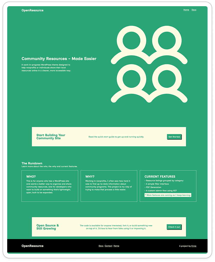
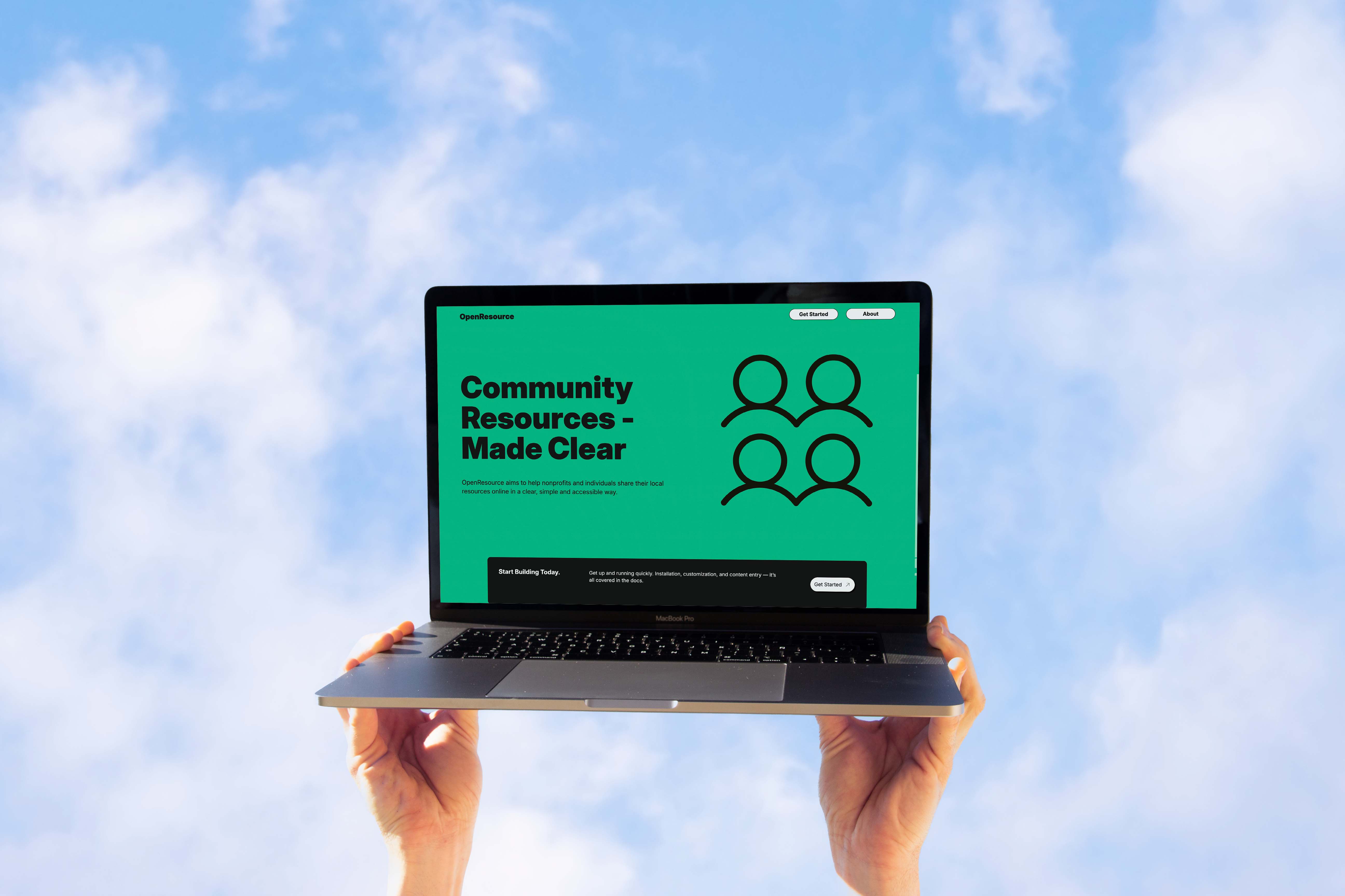
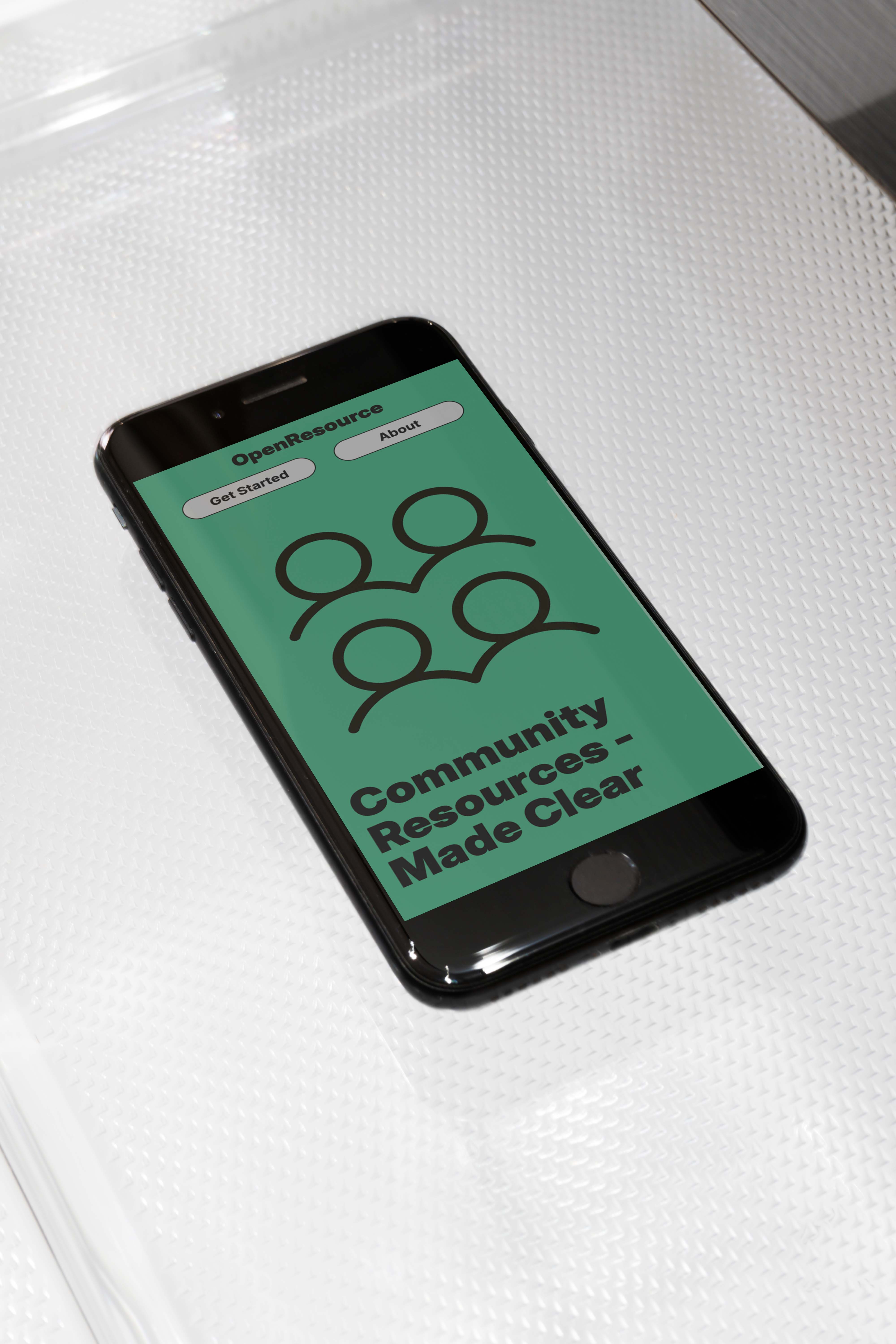
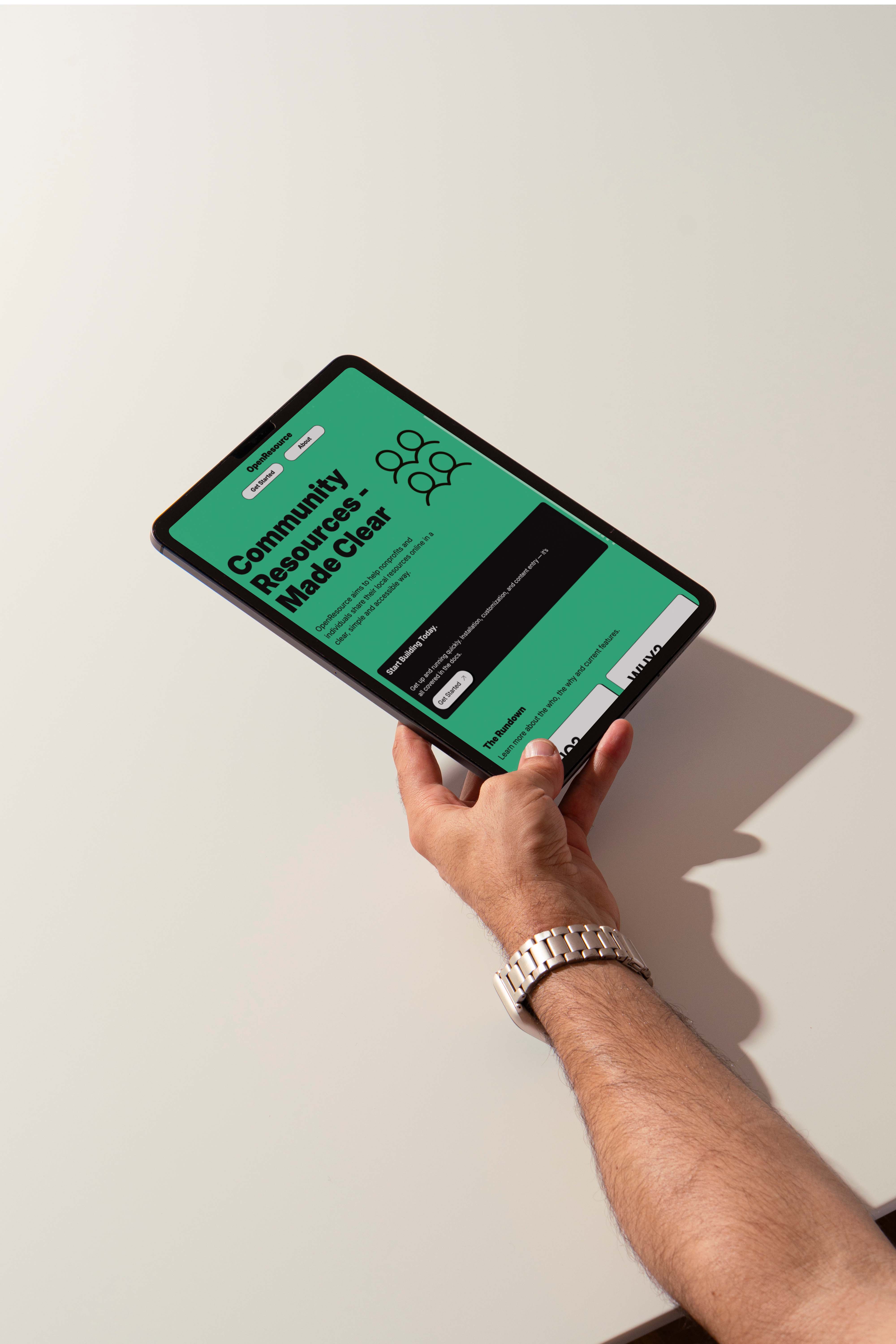
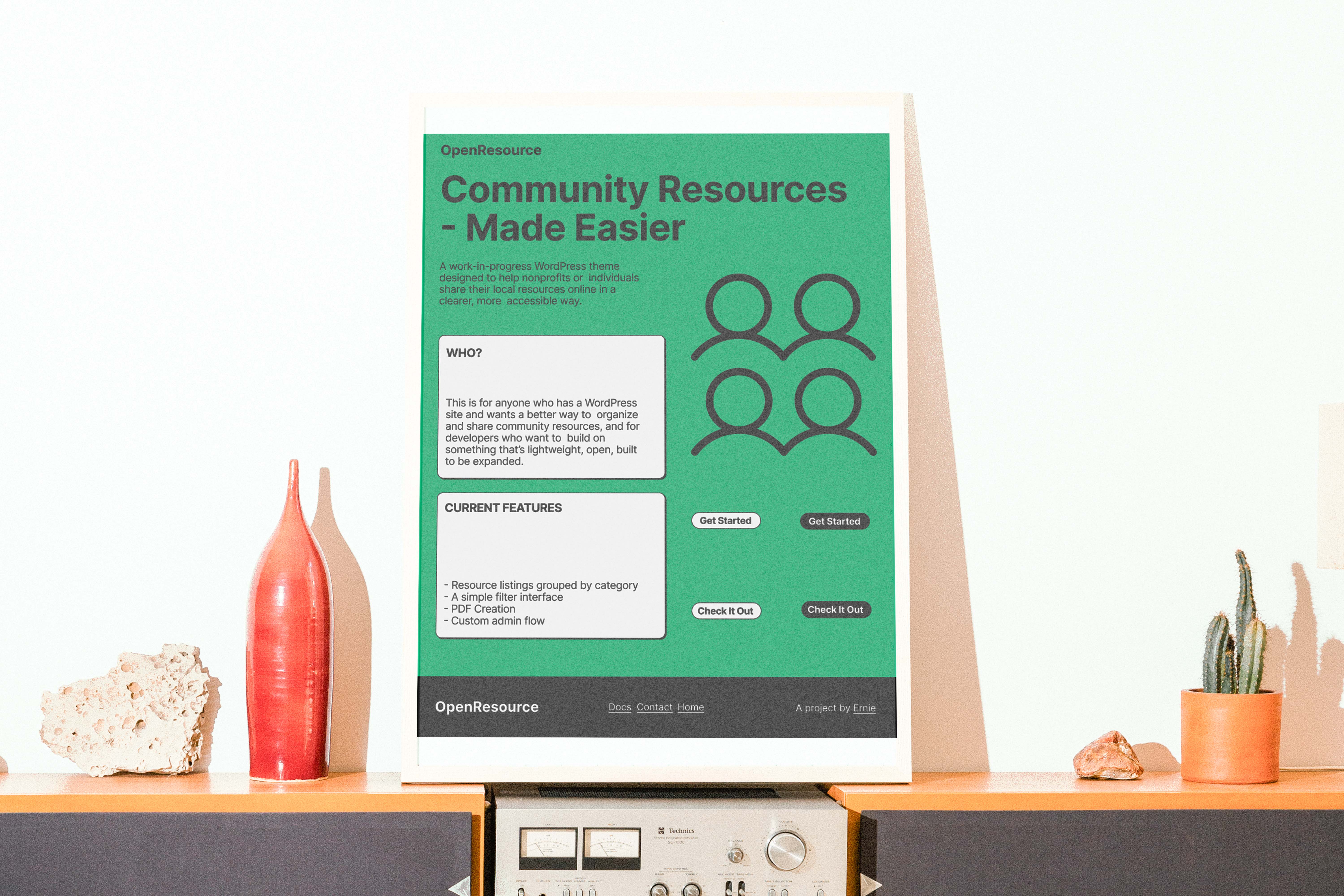
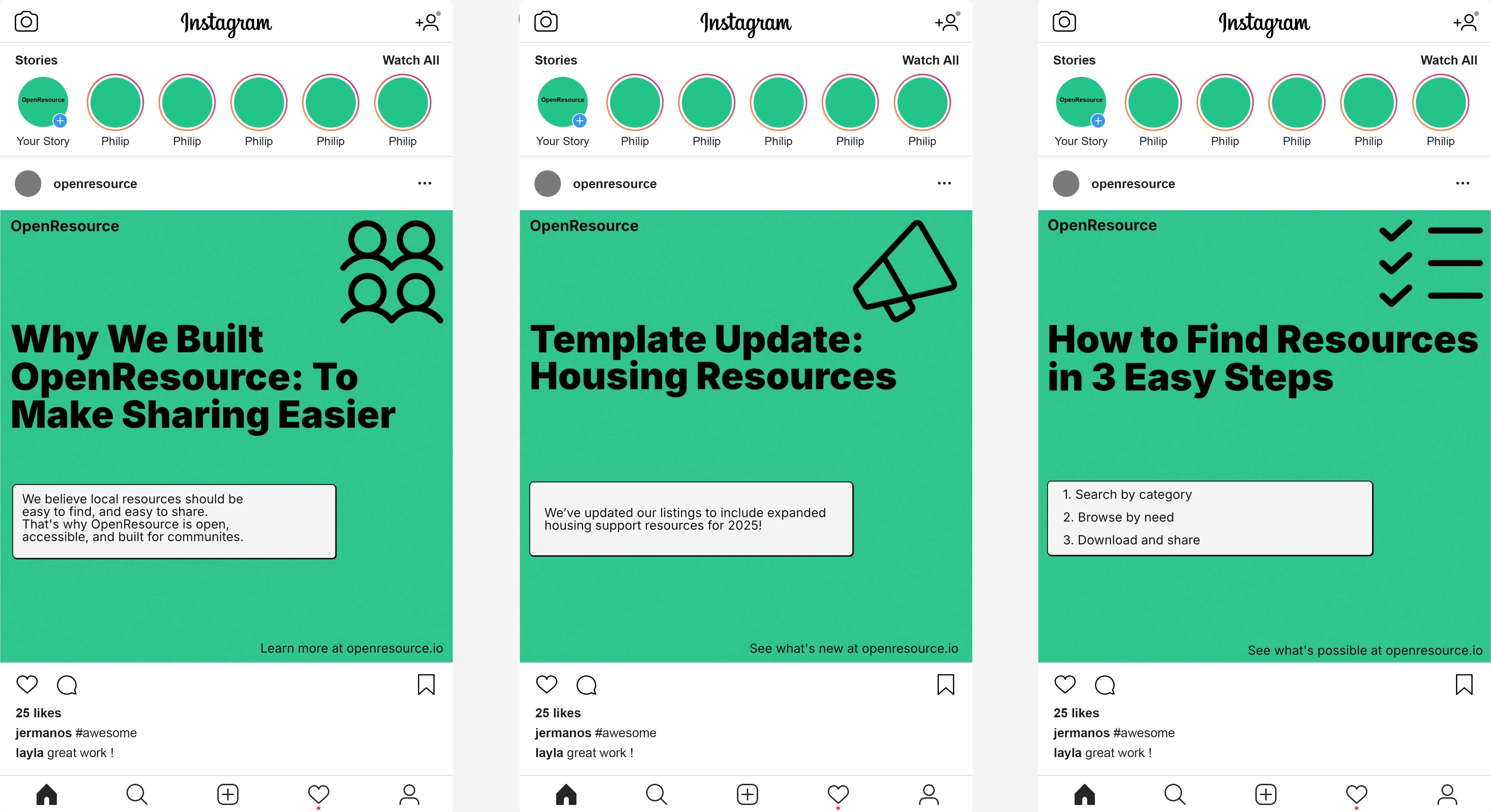
Case study header image

OpenResource

  • Visual Identity
  • Branding
  • WordPress Development
  • UI/UX Design

Initially OpenResource was just a passion project of mine, something I had been thinking about doing but just hadn’t… Until I did.

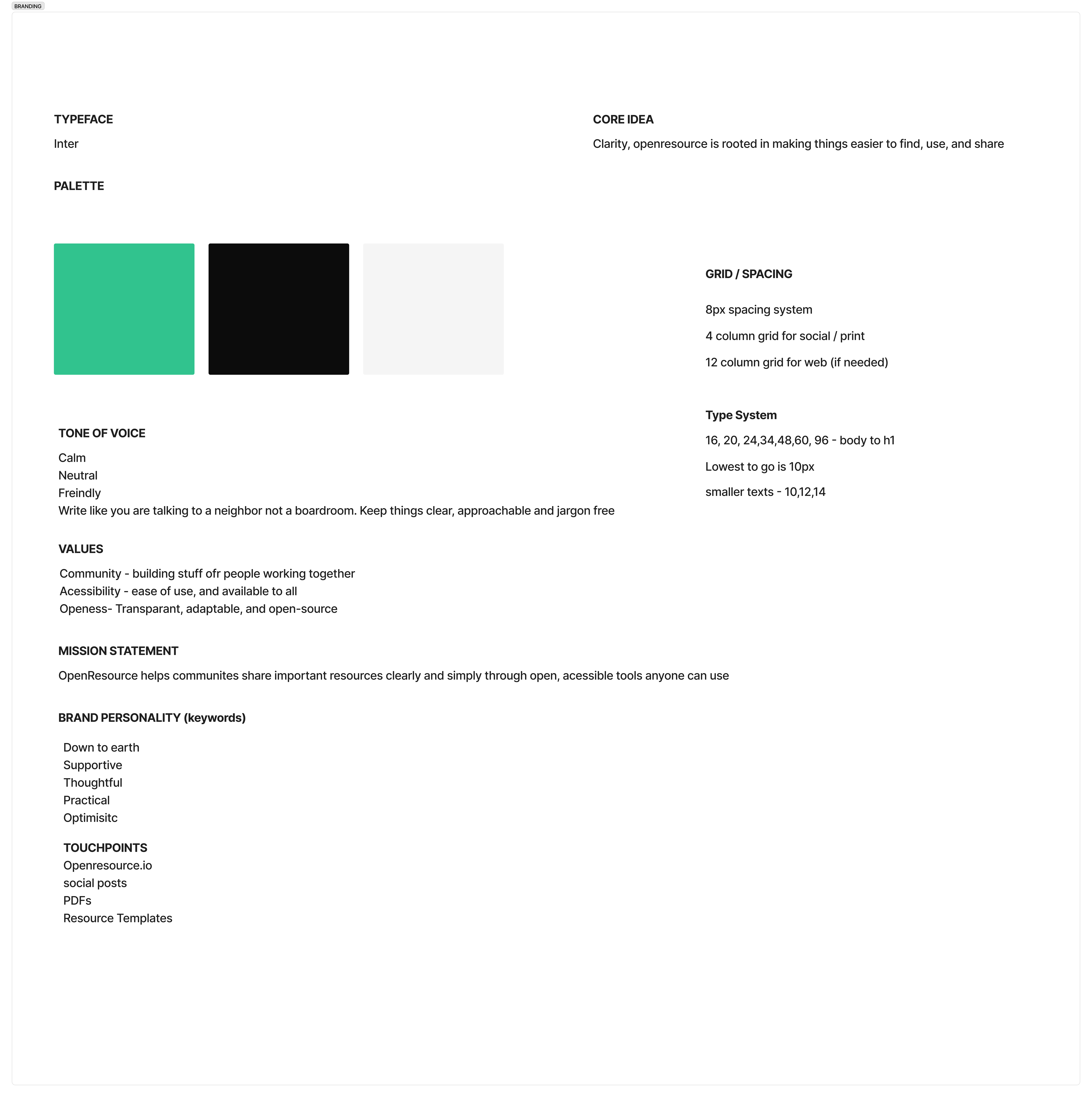
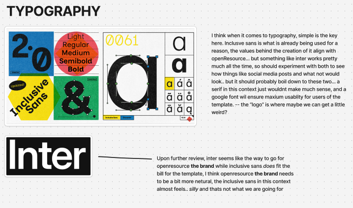
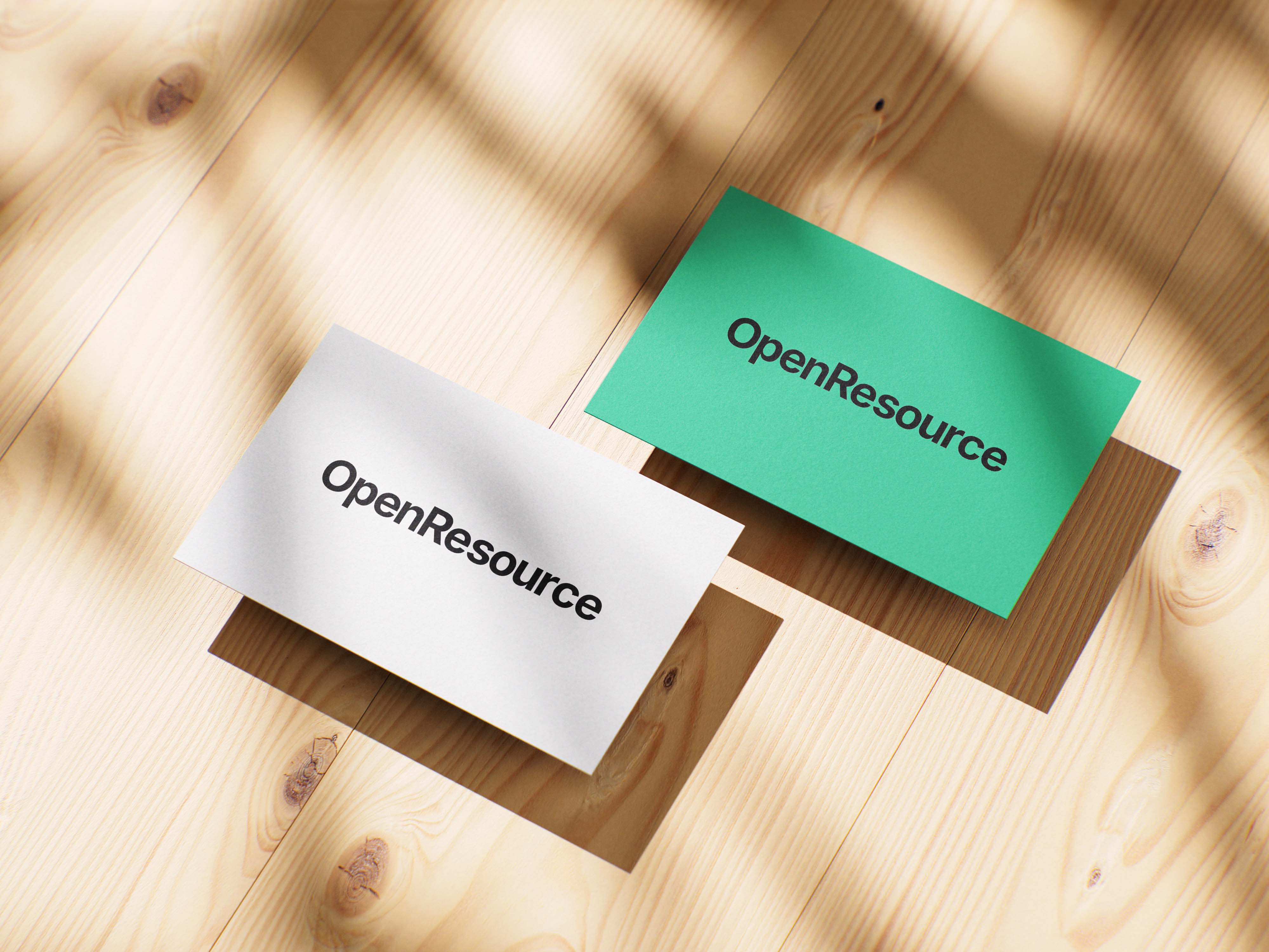
After creating OpenResource, I decided it would be better if it was more than just a WordPress template floating around in the ether. So in an unusual fashion I worked backwards and created a brand to center around the template. Essentially turning OpenResource the theme into OpenResource the project behind the theme.

Case study image
So how did all of this even start?

With a PHP prototype you can check out here or read more about it on my blog. Essentially this was my proof of concept for OpenResource, that A. I could actually make it and B. It wouldn’t be terrible.

After my prototype I was excited to move to phase two which was releasing it as an open sourced project that anyone could grab and make their own!

One problem though… Technical debt.

While yes in theory if I put out that code (it technically is out now if you want it) it would mean that in order for you as the user you would need: A text editor to make changes, some kind of local PHP server to view those changes, and then find a hosting service that supports PHP sites (then either manually move files over or learn how to use git and pipelines). So yeah, not very user friendly.

That's where WordPress enters the picture. As someone who has been around nonprofits for a while both professionally and personally, I knew that they often defaulted to using WordPress for their websites (sometimes Wix and Squarespace, but we shan't speak those names here).
Case study image
So my initial conversion from full PHP prototype to WordPress template turned into this. I kept the name Forsyth Community Resources because at the time that is what made the most sense to me (this was the brand).

This turned out to be one of those projects that given the opportunity could be stuck in development for 3 years while I make it perfect. The goal here was not perfection, just usability. As long as users could find resources, and add them to their PDF which can then be printed or saved, then the project could be released in an alpha state.

Once I did release the theme though a big thing stuck out to me. How do I distinguish the OpenResource theme from Forsyth Community Resources? At that moment they were the same thing.
Case study image
This is when I moved into creating a brand or identity for OpenResource, which was different from Forsyth Community Resources. A wholly backwards way of doing things but hey, that's life sometimes.
Case study image
I started this process by making a separate WordPress site for OpenResource that would act as an introduction to the project / documentation page (once moved out of GitHub).

As you can see I just borrowed the visual identity used for Forsyth Community Resources to try and make a visual language that tied the two things together. However I realized later that this missed the mark. I was technically tying two completely unrelated things together.

OpenResource is one thing: a project which main product is a free open sourced WordPress theme that can be used to make things like FCR. Forsyth Community Resources != OpenResource instead OpenResource allows for things like FCR.

This is when I really broke things down and re-evaluated OpenResource itself.
Case study image
The site in its current state (desktop). I decided to stray away from image usage, and instead focused on using iconography as the main visual asset. I used icons from the Phosphor icon library to support another open sourced project.
Case study image
Site on Mobile.
Case study image
Site on Tablet.
Case study image
It took a while to really break down OpenResource into its own thing (a brand if you will) due to the fact that I had really engrained the product (template) with the project. Kind of how everyone knows about ChatGPT but not everyone knows about Open AI. The project boils down to one word ‘clarity’, meaning OpenResource wants to make getting resources as available and easy to get for as many people as possible. So this is where the great divide began.
Case study image
One of the biggest visual changes was the typeface. Initially I used the same typeface from the template: Inclusive Sans, and while I feel that this typeface is still a good choice for the actual theme it made less sense for OpenResource as a brand. Its human touches made it feel almost not serious. So that is why I changed to using a more neutral and definitely not overused type: Inter. The main reason being that if I was going to be using the green (explained later) as a main color, it would need to be contrasted by something with a little less character or opinions.
Case study image
I used this typeface to create a wordmark because I felt that a full logo would detract from the project's message of clarity and just didn’t really fit in this context. With its name clearly printed it speaks to the fact that OpenResource strives for clarity.

As seen here it can even be used in more professional scenarios like business cards.
Case study image
I did explore a more fun option however, fun wasn’t a brand keyword, friendly was and I felt that while those can work in tandem, in this case it made it feel like I wasn’t taking things seriously, so I axed that idea.
Case study image
For the palette I kept the original green while tweaking it slightly to get a better contrast ratio with the black text. If you look closely you might think I just ripped the Hulu colors. You’d be right to think that. I thought that too.

I felt that the green worked best as a color that was both friendly and welcoming, while blending with the neutral typeface in a calm way. Also if we want to zoom out, green can be aligned with go (green light), and that's what OpenResource is trying to achieve, removing the friction (red light) of getting resources, and giving communities the tools to make things for themselves by themselves.
Case study image
With the OpenResource ‘Brand’ established, I explored different ways this could be used such as templates for social media posts. Should that ever become a thing.