Trendiness Vs Timelessness
Year: 2025
What I did: Branding, Web Design
Completed
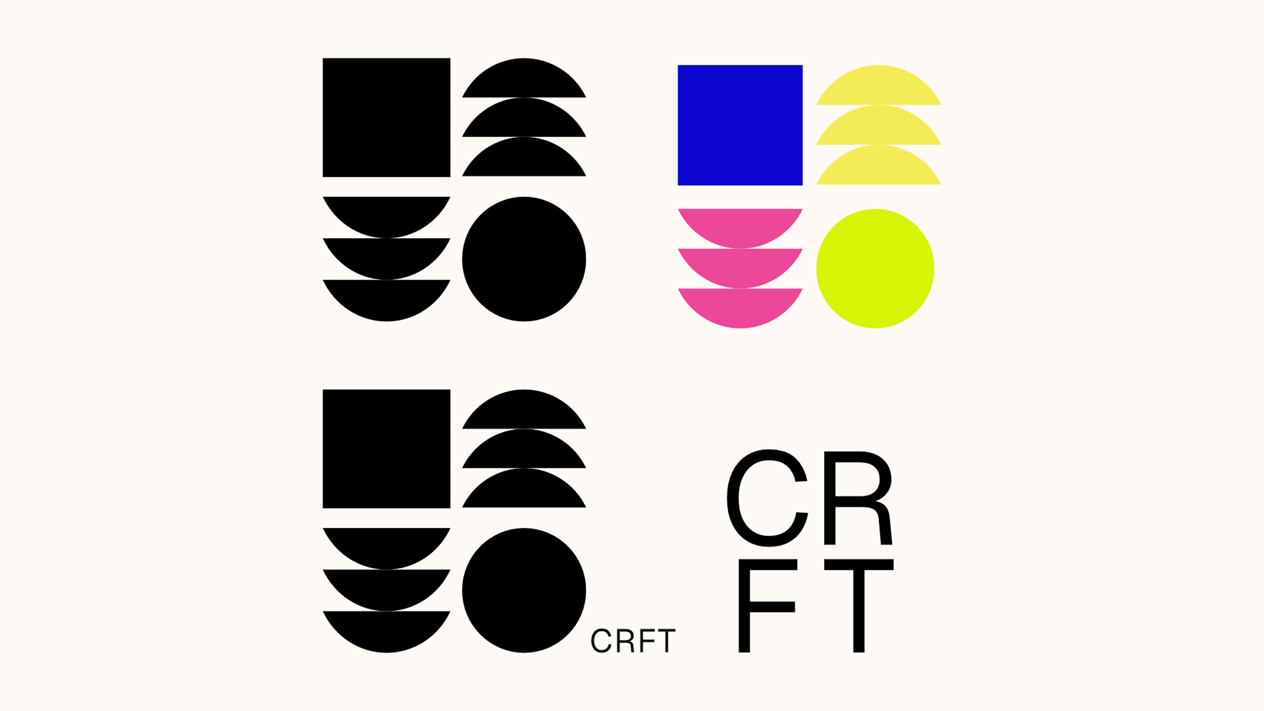
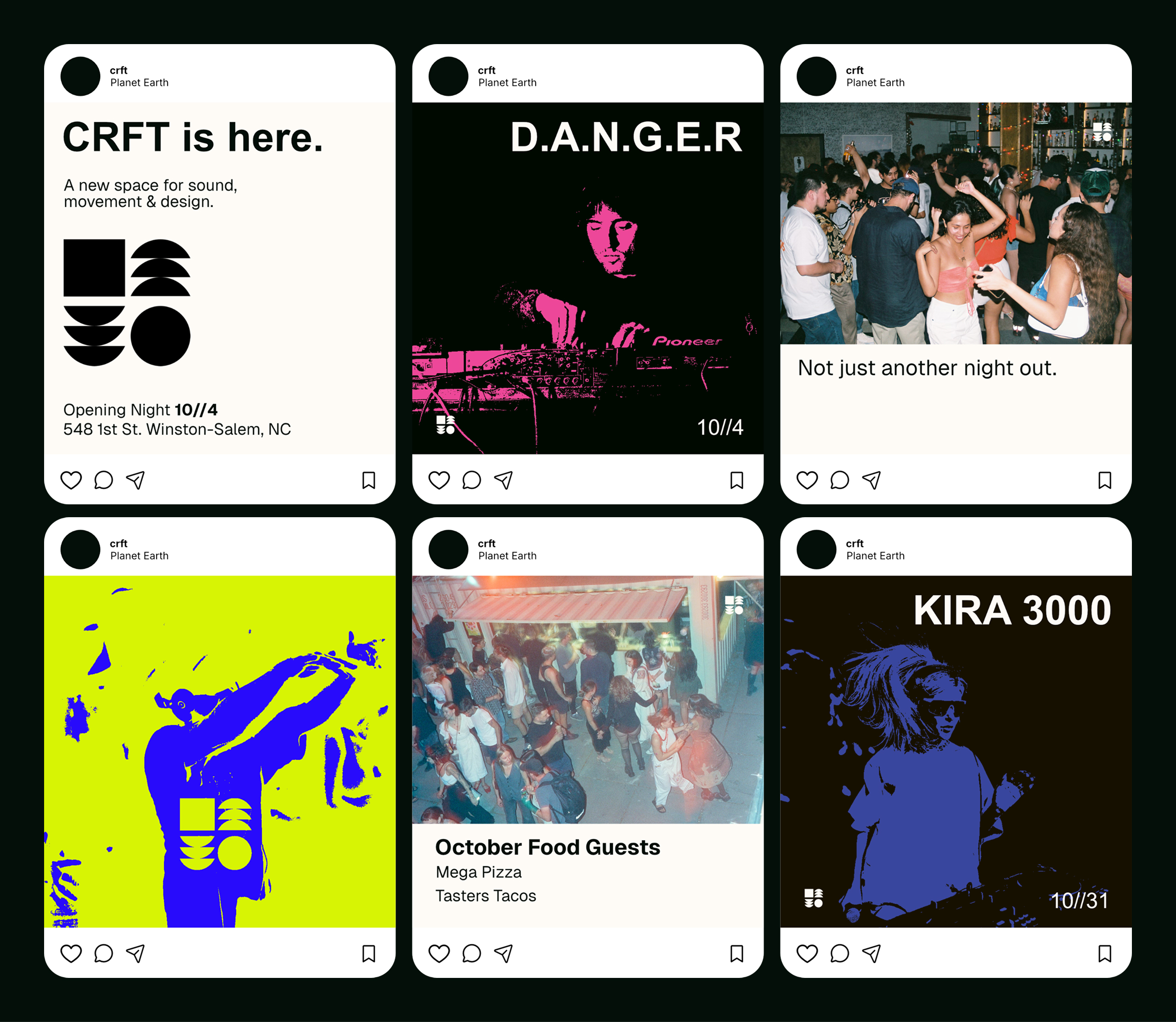
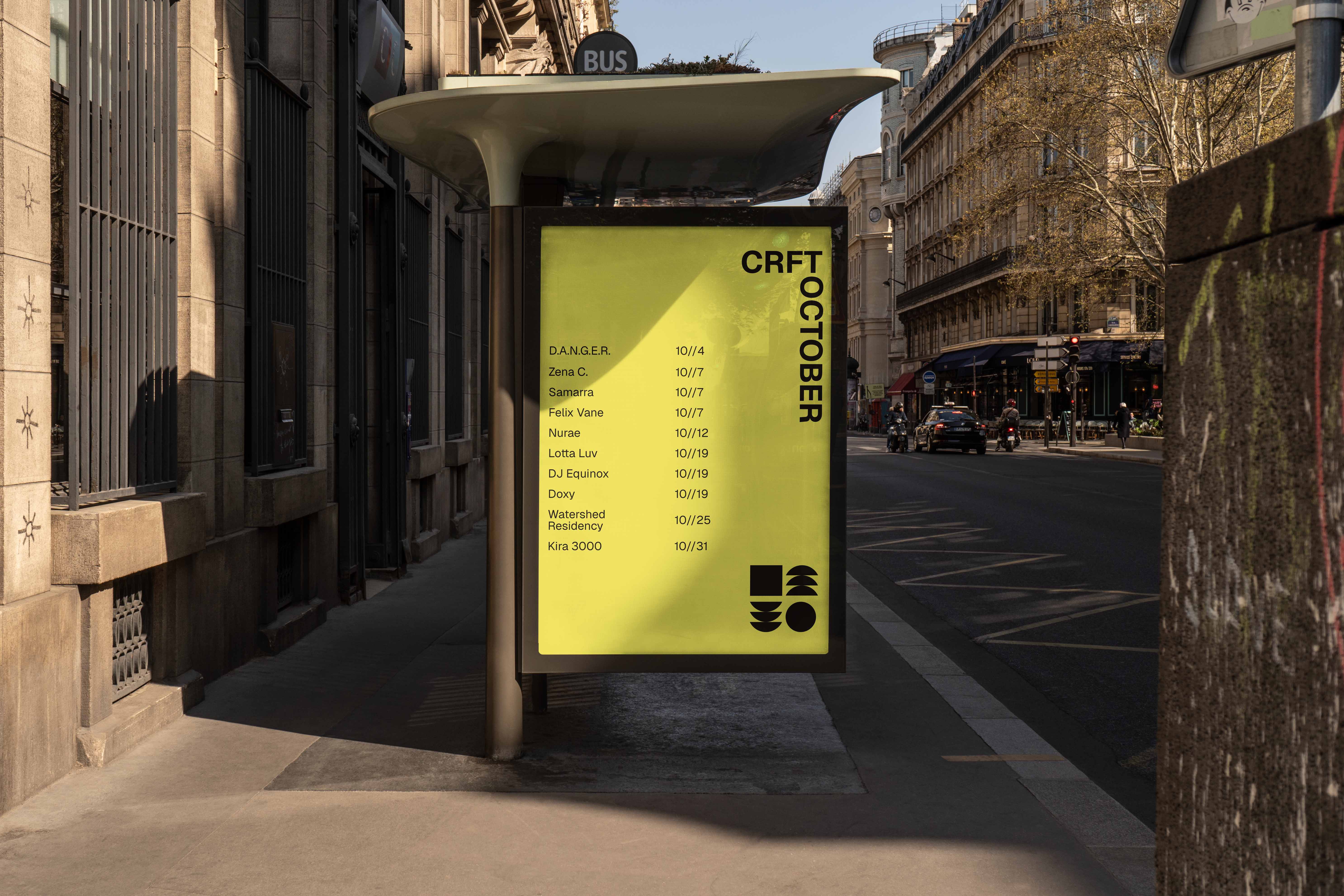
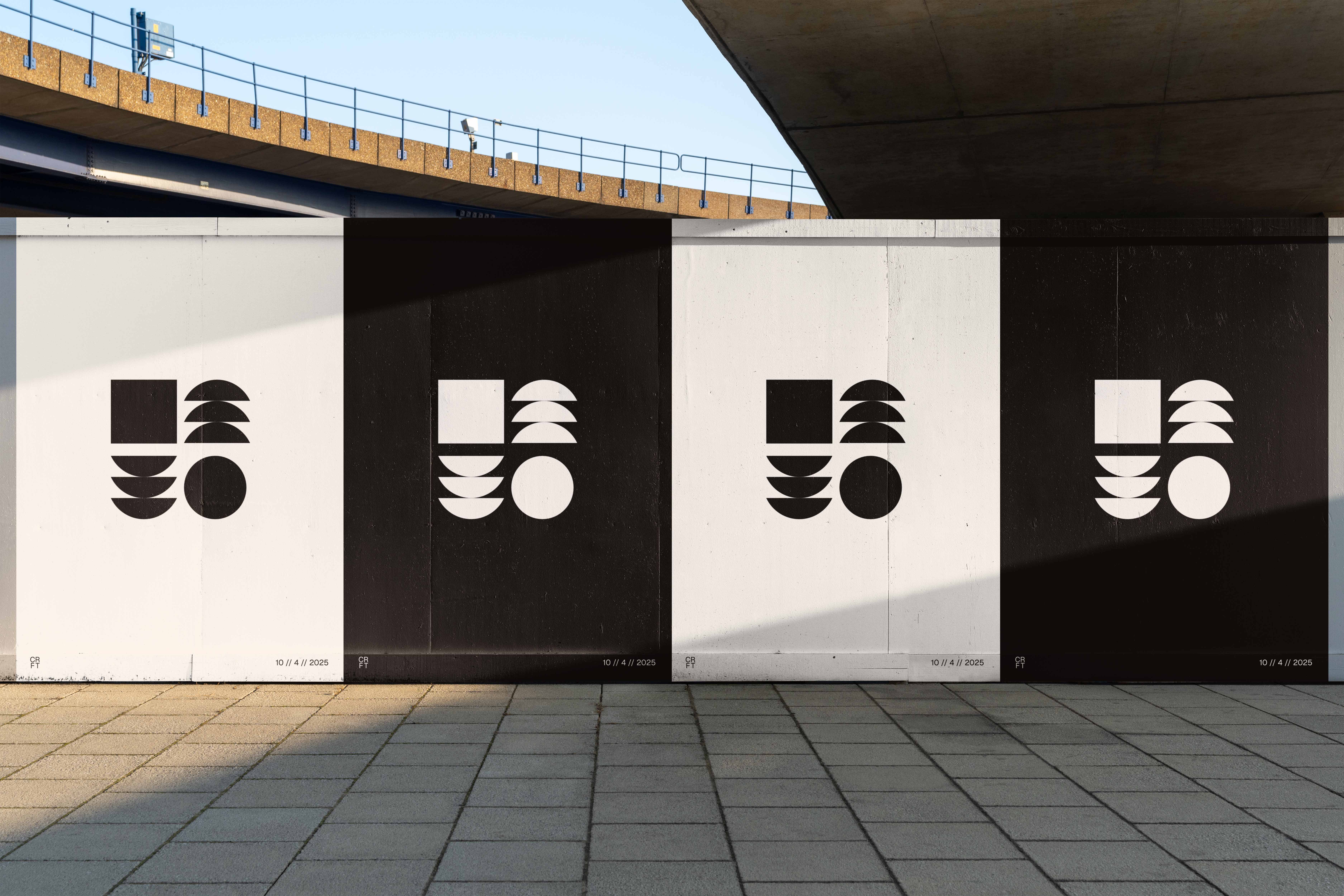
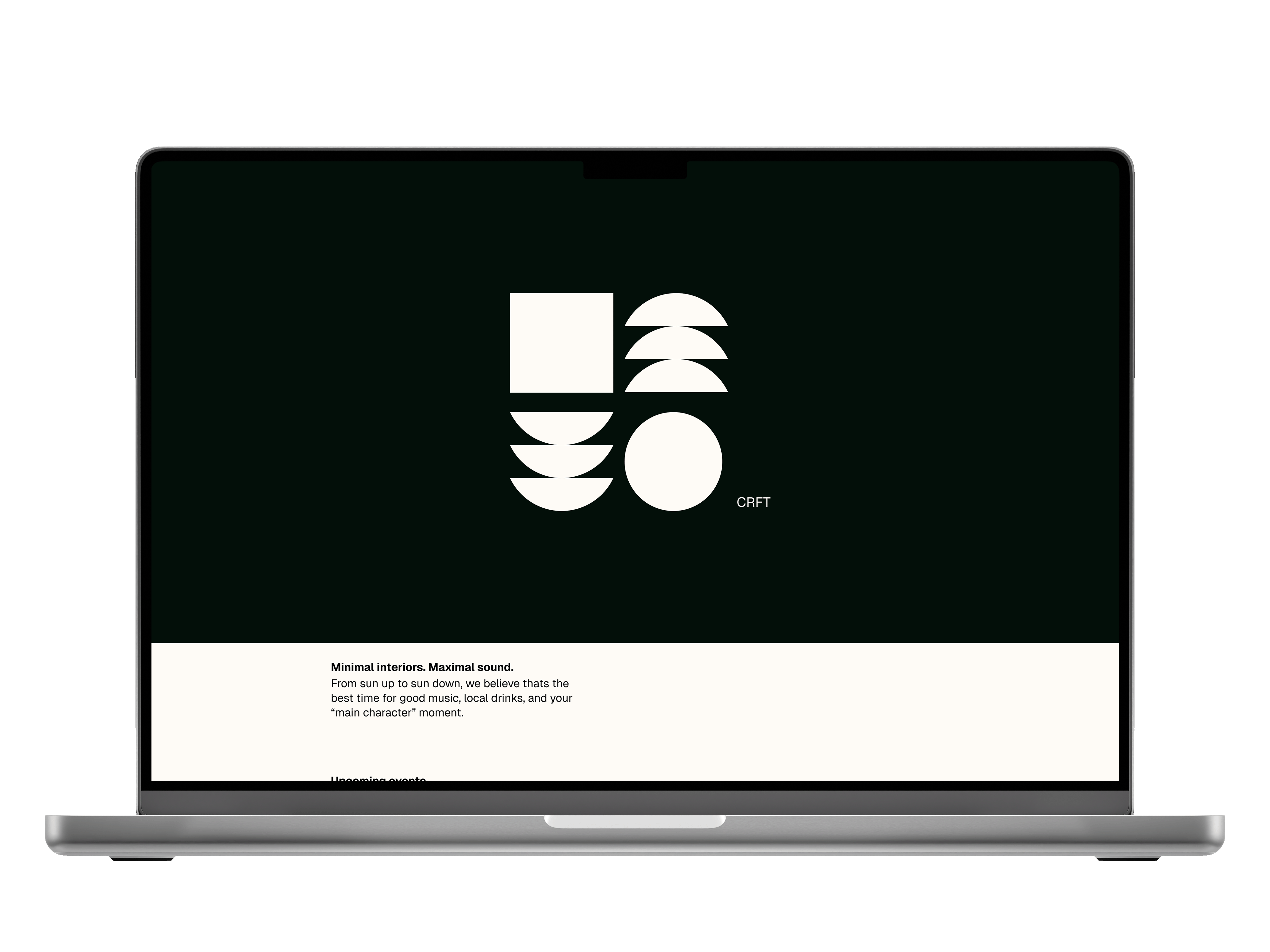
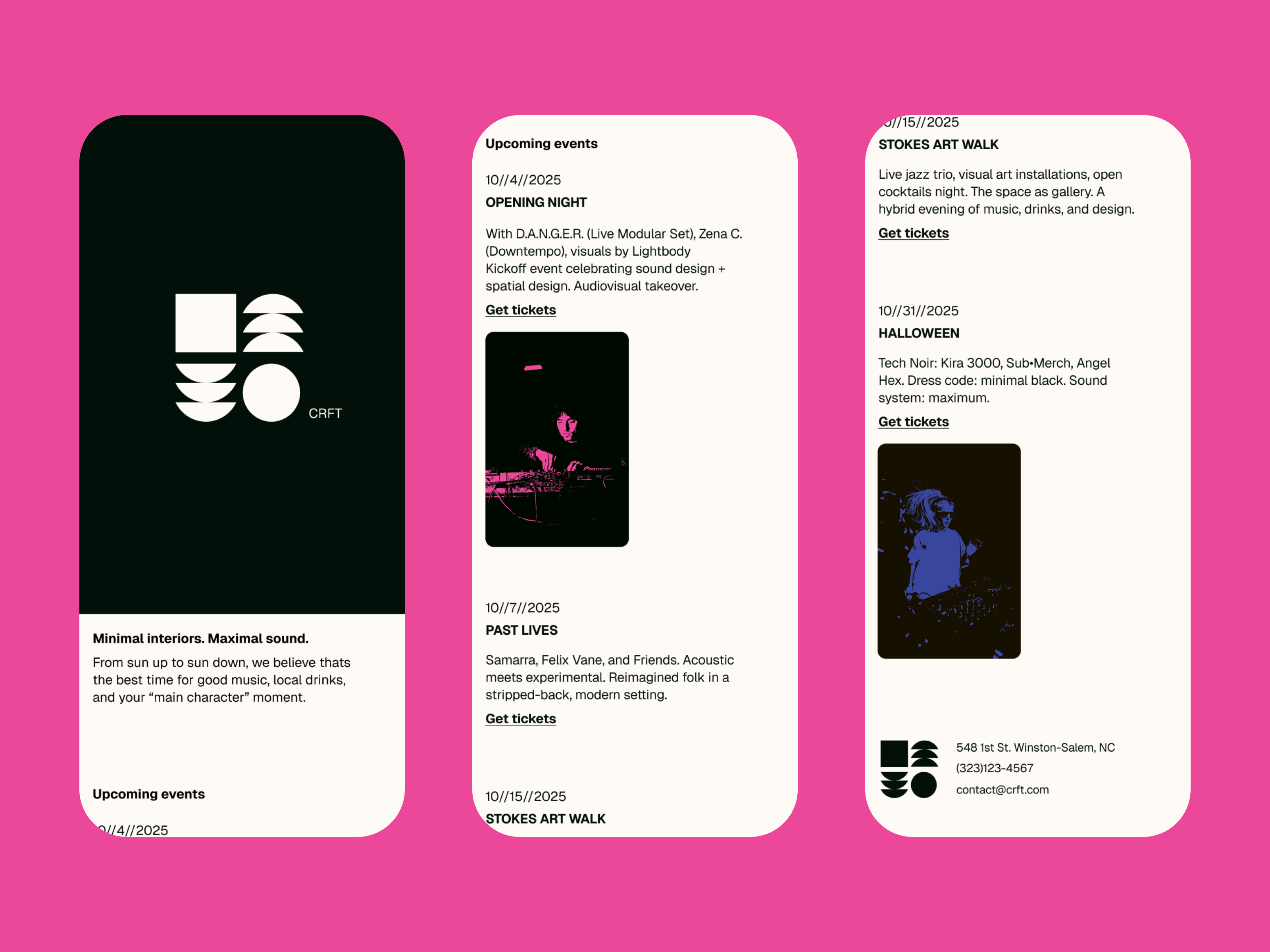
CRFT, a new multiuse music venue, struggled to express its identity across both digital and physical spaces. Their presence felt fragmented; serious in concept but lacking a system that could flex between nightlife energy and cultural credibility. I took on the project to build a modular brand that could capture both sides: adaptable, consistent, and bold. The result was a logo system inspired by the venue’s architecture and rhythm, using shapes to represent its core pillars and, a design language that extended seamlessly from social media to posters. To complete the experience, I designed a minimalist website that functions like a live lineup poster, tying the whole ecosystem together into a confident, cohesive brand.

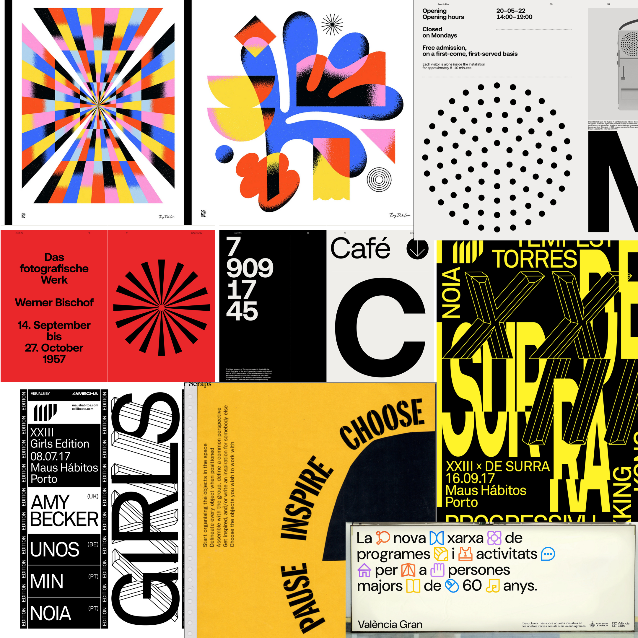
Research
I start most projects with a research phase (super unique I know!). However this brief came with a general style direction the client wanted to go with. So I dug through my archives to find vibrant energetic stuff, coupled with some more utilitarian / architectual inspiration. The goal at this stage was to get a solid grasp of what the visuals could look like, pair that with the project goals and to see what other venues were doing.