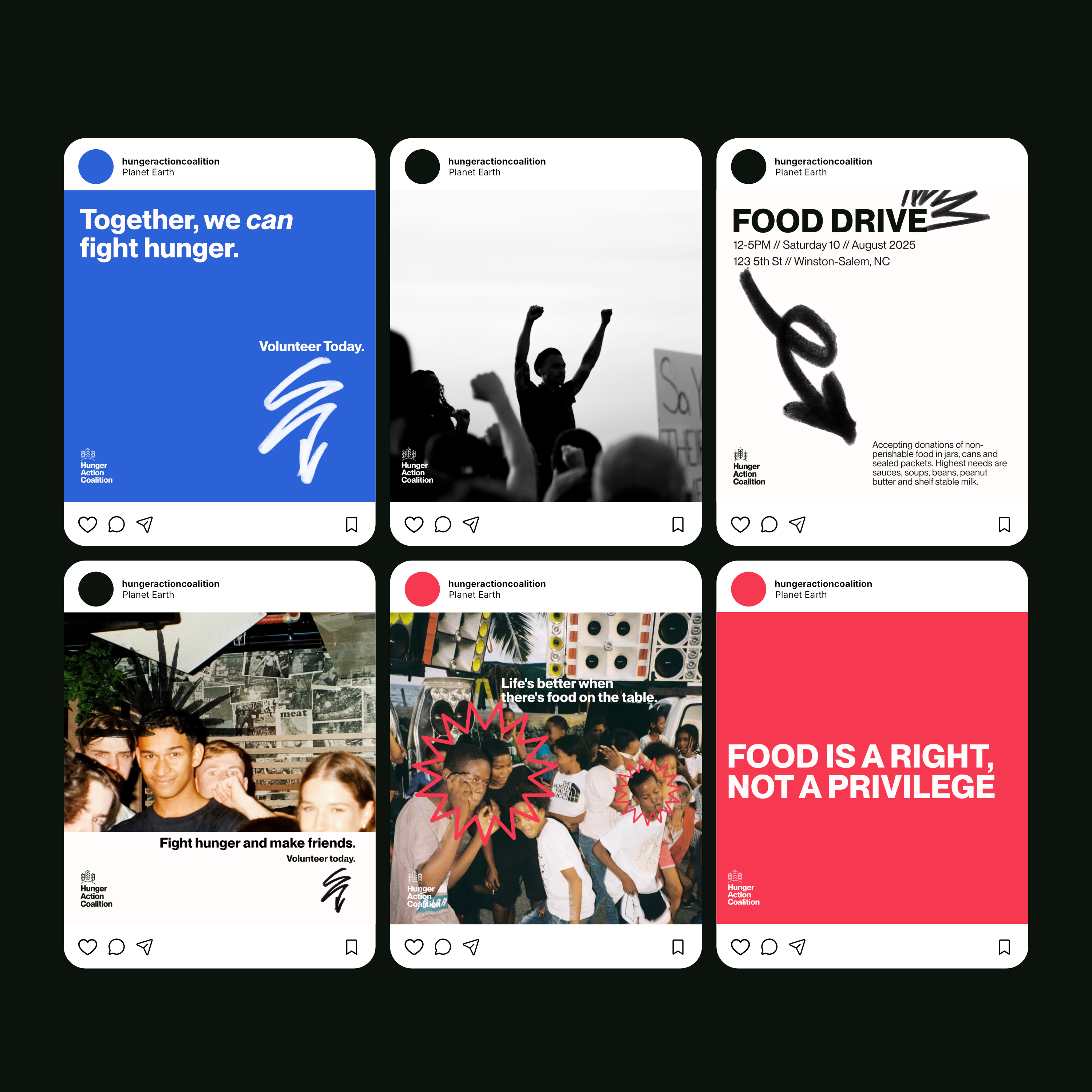
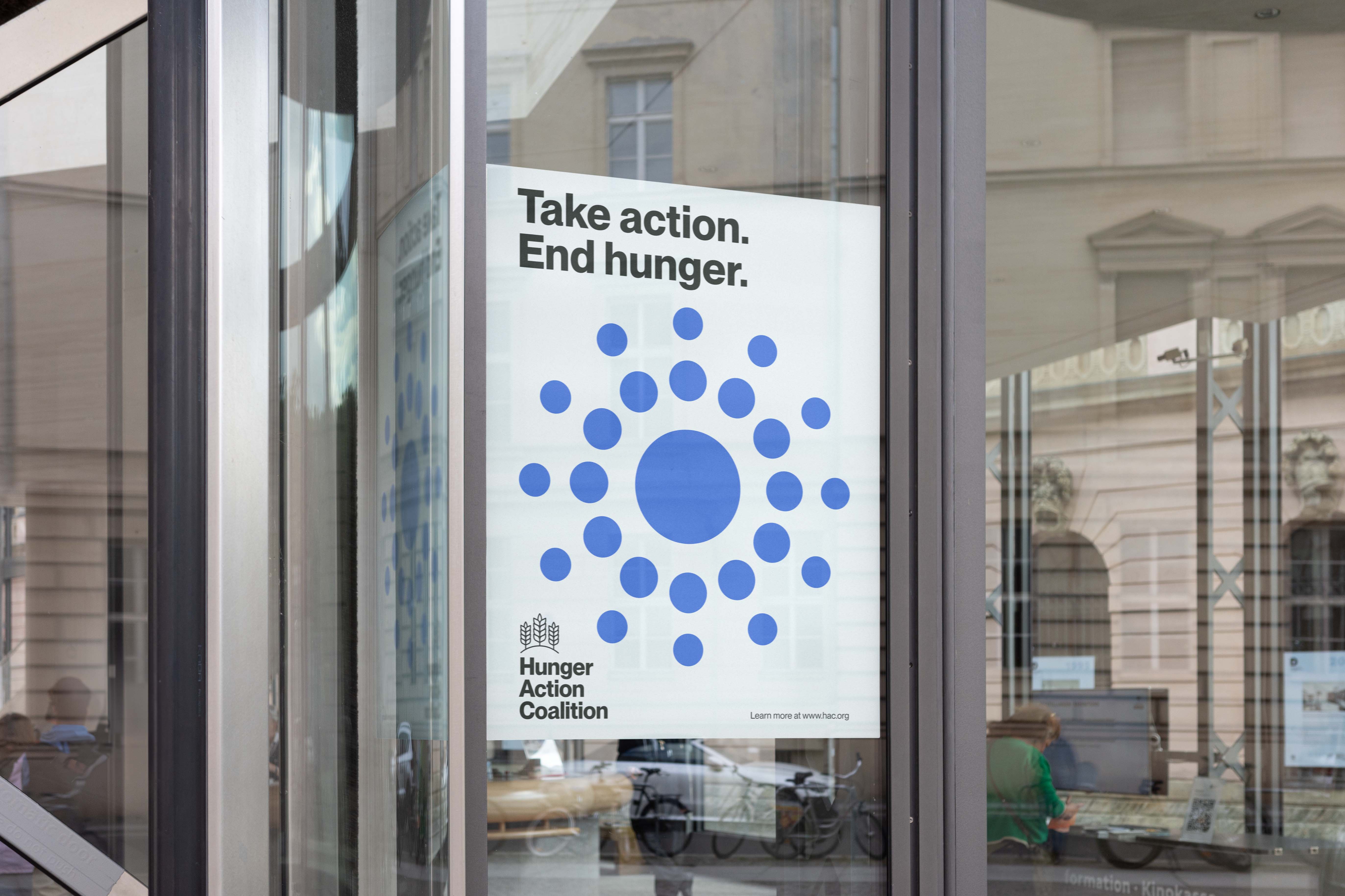
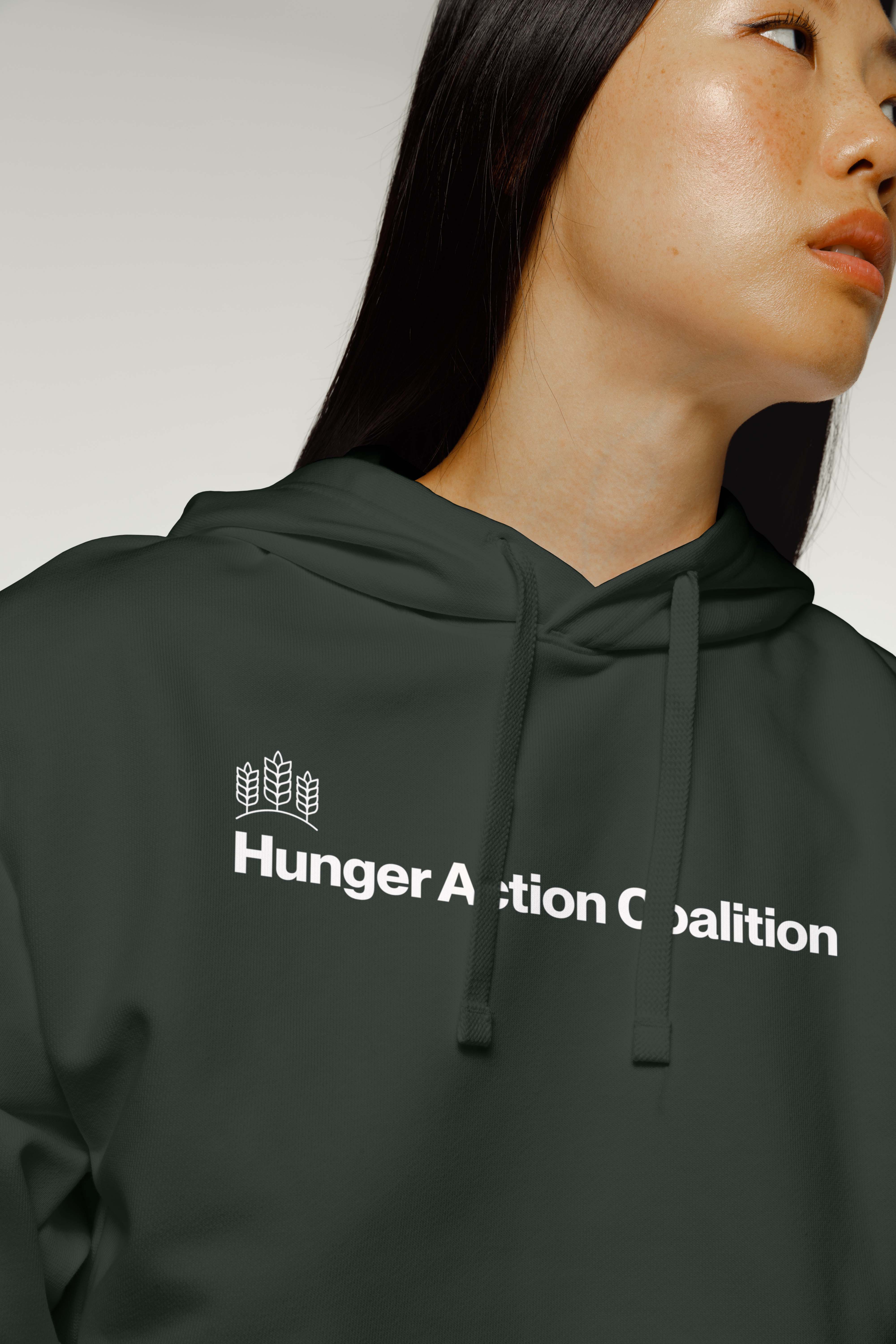
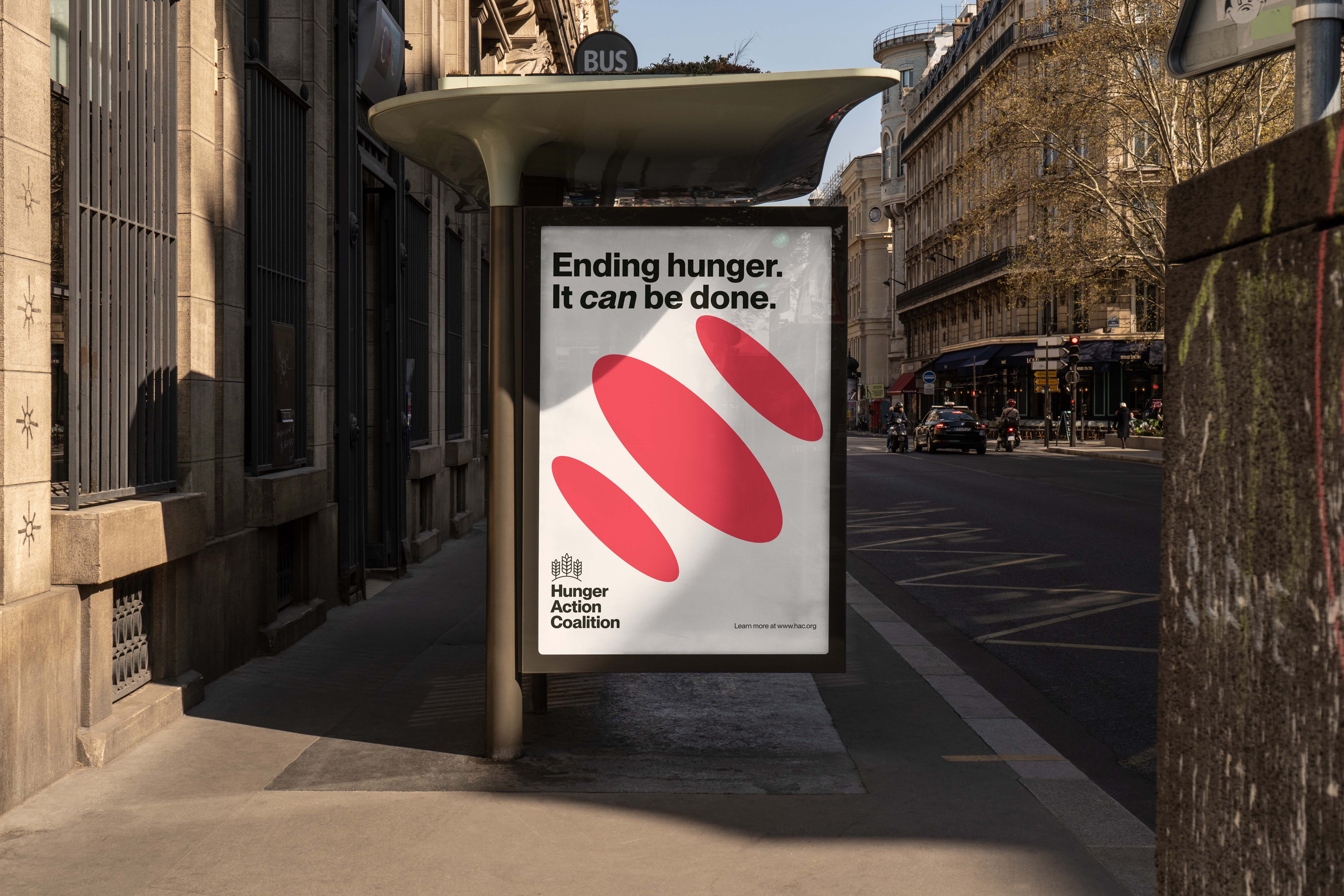
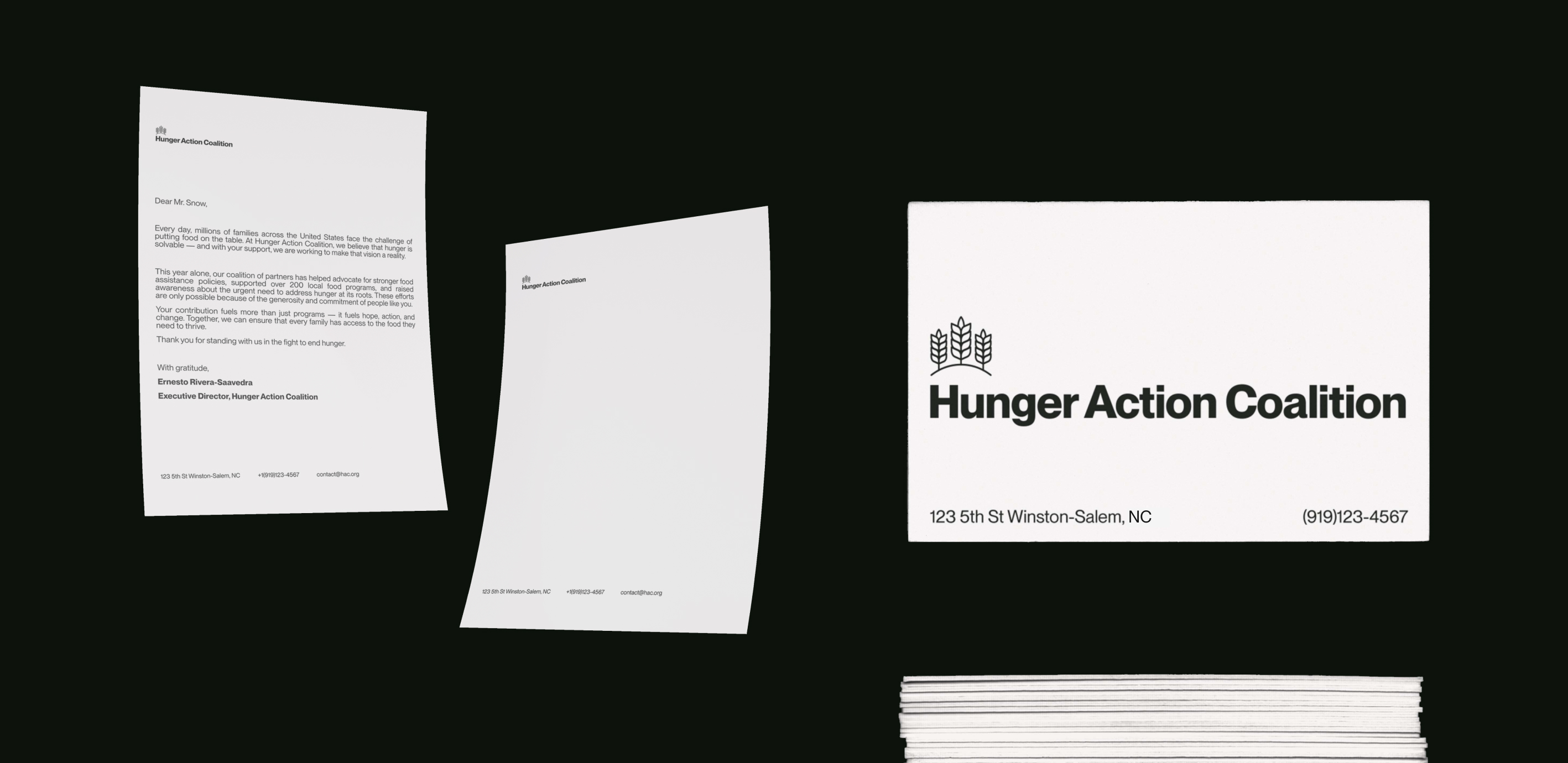
Branding for Clarity
Year: 2025
What I did: Branding, Visual Identity
Completed
Overview
I’ve seen firsthand how often nonprofits struggle with scattered visuals; logos used inconsistently, colors chosen on a whim, and a new font for every project. This inconsistency undermines credibility with donors and causes unnecessary confusion for organization members. In this project, I set out to design a simple, unified brand system for a conceptual nonprofit. The challenge being making a brand clear enough for everyday use while staying flexible enough to grow with the organization.


Social Media
Social media is often where inconsistency shows up the most, with posts that don’t look related, graphics that are hard to read, or colors that are not aligned with the brand. I designed a set of templates for Instagram that lock in brand colors, fonts and logo usage. The goal being to ensure every post reinforces the brand identity regardless of who on staff is creating content.

Brand in Action
Being an organization with real impact means you cant live in the metaverse only, you have to show up in the real world, from posters on the street to letterheads for capitol hill. Each application should demonstrate how the palette, typography, and logo system work together to create a professional, trustworthy presence.


Web Design
To round everything out I used the brand system to create landing pages for both a home page and a more volunteer centric page.
Conclusion
I took this project on to showcase how a lightweight brand system can make nonprofit communications more consistent and credible. Through a clear identity and practical templates, staff can spend less time “winging it” and more time focusing on the mission and delivering impactful work. The result here is clarity, confidence, and a stronger donor and community presence.