Organizing Communications
Year: 2025
What I did: Communications, Brand Strategy
Completed
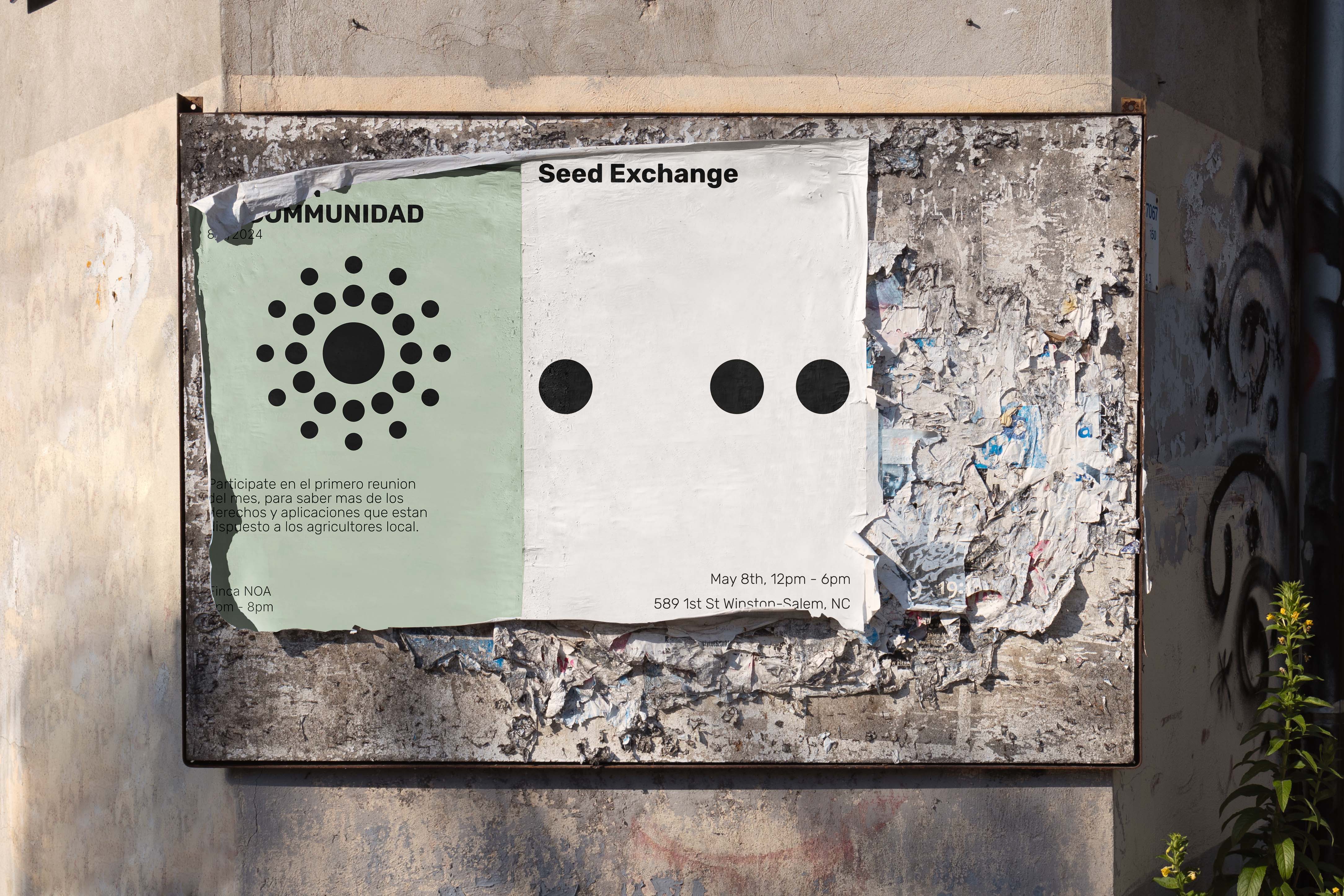
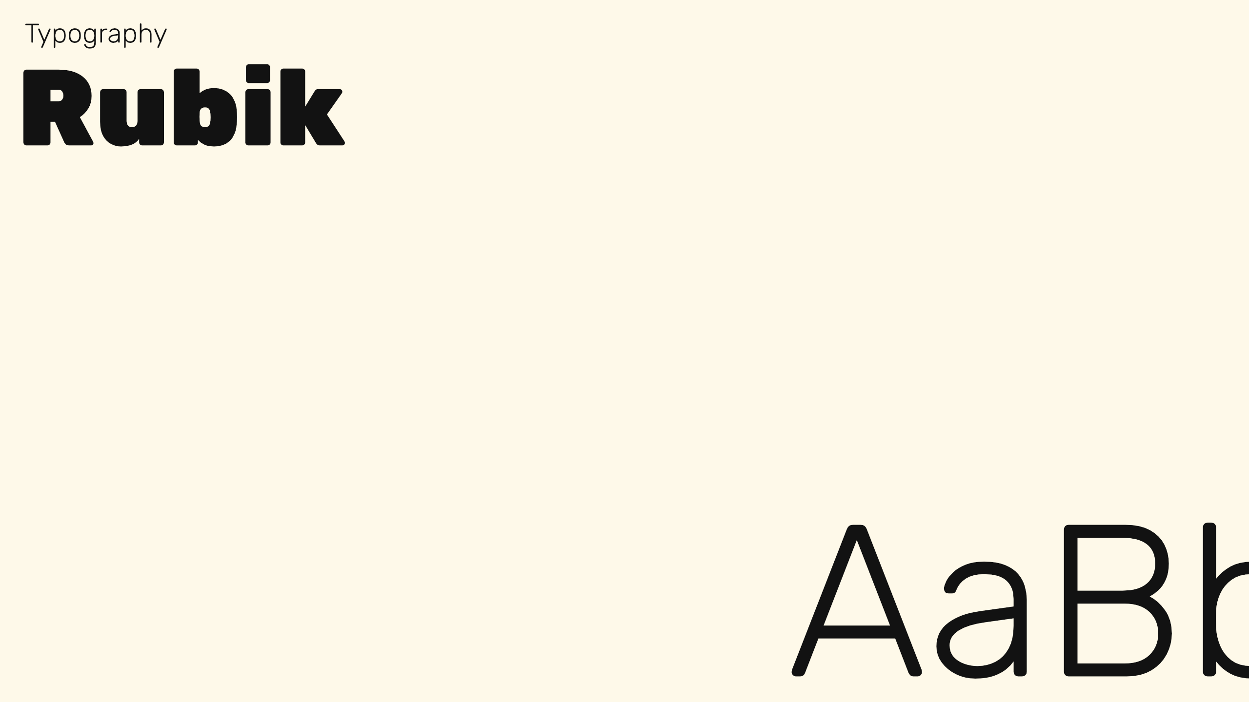
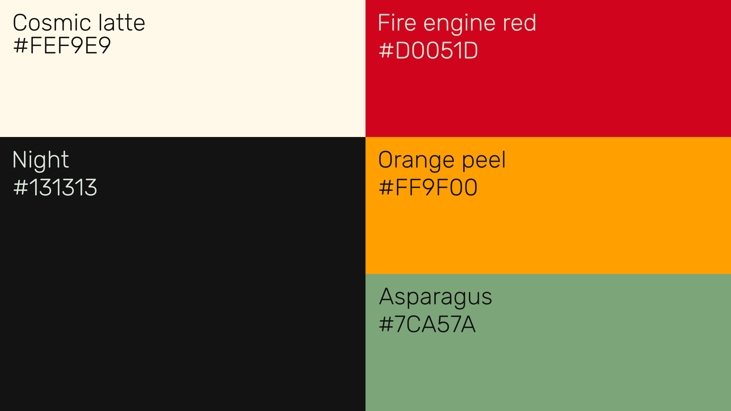
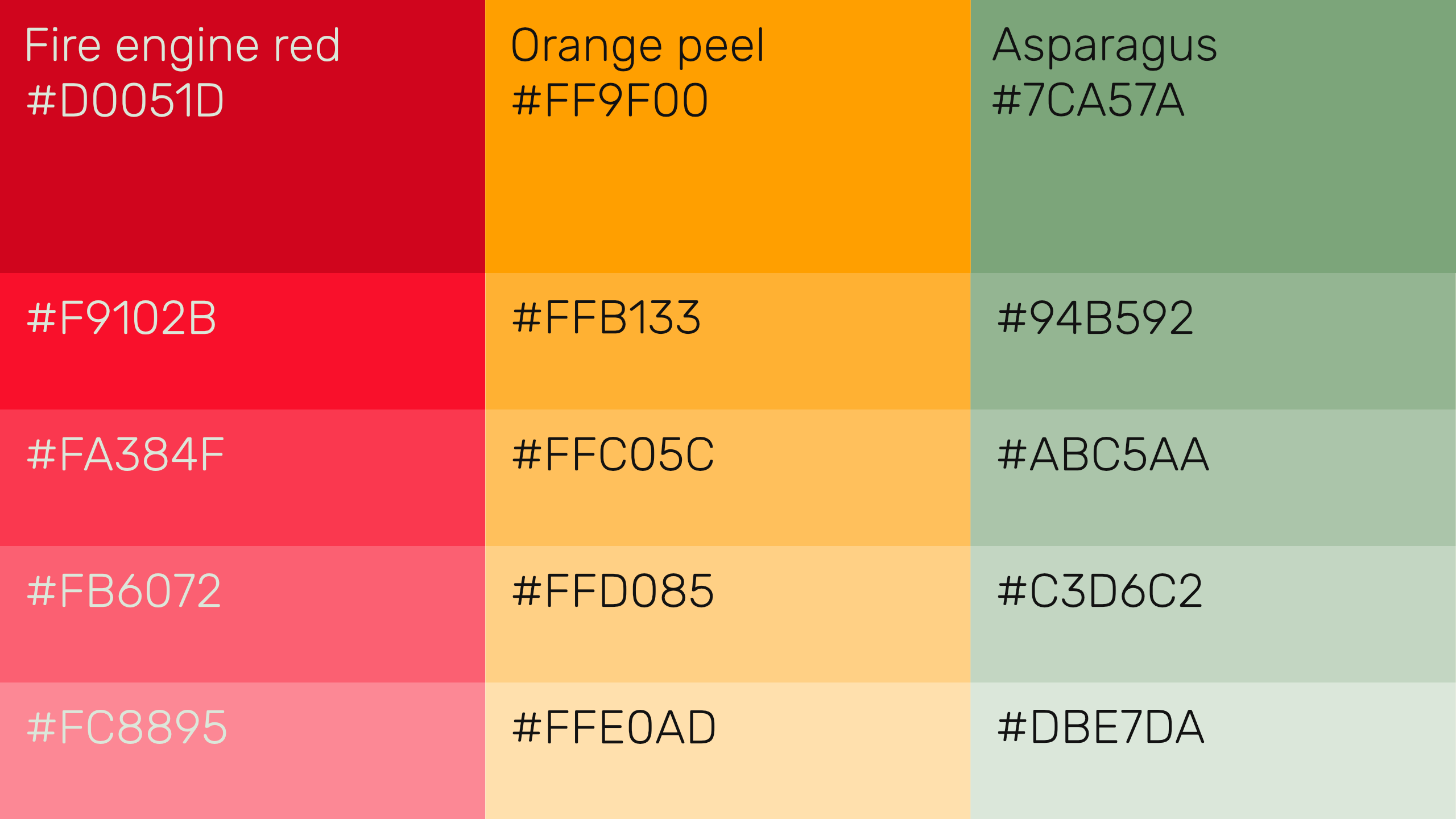
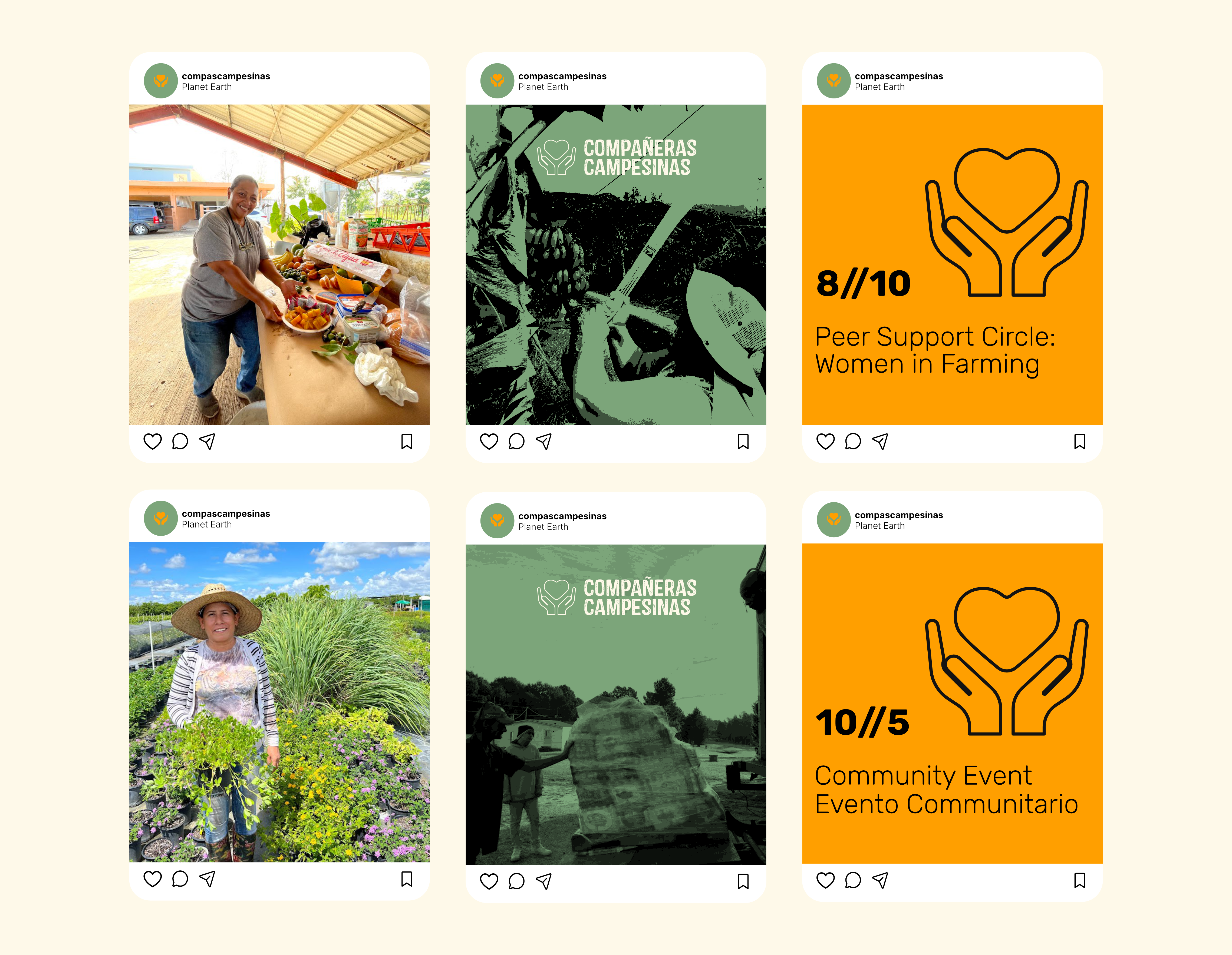
Compañeras Campesinas, an organization supporting rural Latina women, had a logo and colors but lacked a clear visual system. Their materials felt inconsistent and disconnected. I created a practical brand toolkit that unified their assets and made it easy for staff to manage communications without outside help. The result demonstrates how structure can strengthen impact and preserve community focus.